


Next: Glossary of Time
Up: Development of Methods
Previous: Discussion and Epilogue
Contents
The Prototype Application TUPF
Some of the developed methods require large amounts of calculations to be
performed, thus a prototype application was programmed. It was crucial to have
a high computational performance, so the following technical environment was
used:
- Operating System: Unix (Sun Solaris)
- Hardware: Sun Sparc
- Programming Language: C
- GUI: X-Windows with Xt- and Motif-Toolkits
- GIS-Integration: ODE from ESRI
For portability and reasons of distribution the choice of higher level
languages such as Java or Avenue were considered, but because it
was necessary to achieve maximum performance the above listed environment was
chosen. The hardware chosen was determined by the availability at the
institute and the need for integration with a GIS (Arc/Info), which was only
available on the Sun Sparc platform.
In the following I will explain the basic elements of the user interface,
followed by several examples showing the capabilities of the prototype
application TUPF. As it is difficult to describe dynamic methods on a static
printed paper, the CD-Version of this work additionally includes several
animations of the application.
The application consists of a main window and several auxiliary windows. The
main window itself contains four elements (figure A.1):
- the menu bar (A)
- the map window (B)
- the selection bars to determine the standard temporal data frame to be
displayed in the map window (C)
- and an area for visualisation and statistical tools (D)
Figure A.1:
The prototype
application TUPF: the elements of the main window. A: menu bar, B: map
window, C: selection bars to determine the standard temporal data frame to
be displayed in the map window, D: visualisation and statistical tools.
|
|
As can be seen in figure A.1 a special test was
rewritten and integrated into the application for a powerful
comparison of two or more point distributions. It is Biondini's Multi
Response Permutation Procedure which tests whether the groups
originate from the same or a different distribution by exchanging
observations between the groups (Biondini et al., 1988).
In figures A.2 and A.3 examples are
shown for the basic selection of data. They can be refined by applying
several other temporal data frames. Four sets of cyclic aspects were
implemented in the prototype:
- Solar elevation
- Solar azimuth
- Lunar elevation
- Lunar illumination
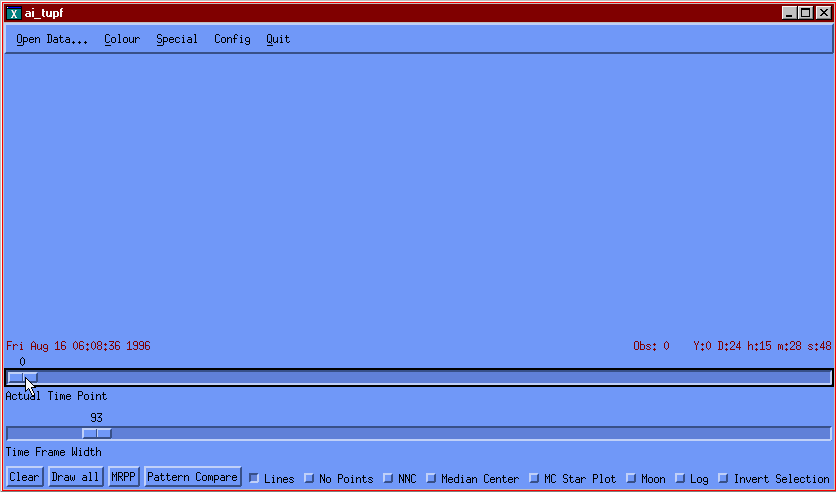
Figure A.2:
The prototype
application TUPF: With the scalebar indicated with the green arrow the
time point of the temporal data frame can be defined and
changed. The blue arrow points to the place where the actual time
point (middle point of the TDF) is indicated.
Animation:
AVI or
QuickTime Movie or
animated GIF.
|
|
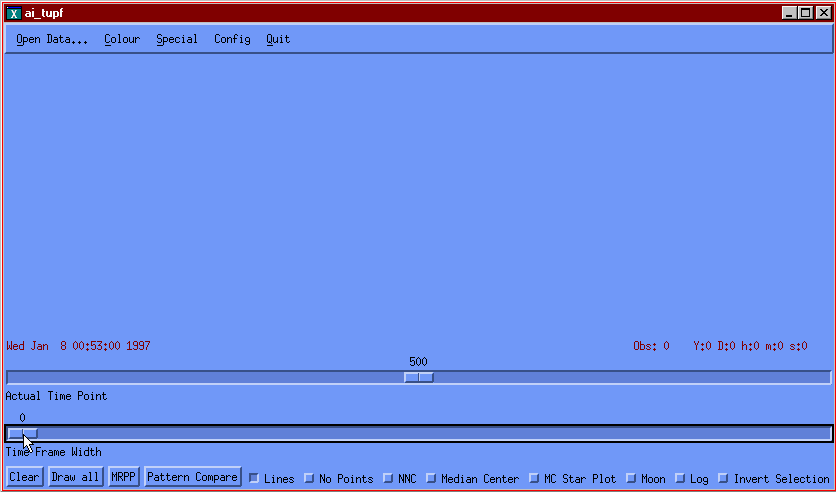
Figure A.3:
The prototype
application TUPF: With the scalebar indicated with the green arrow the
width of the temporal data frame can be defined and changed. The
blue arrow points to the place where the data frame width
(in days, hours, minutes and seconds) is indicated.
Animation:
AVI or
QuickTime Movie or
animated GIF.
|
|
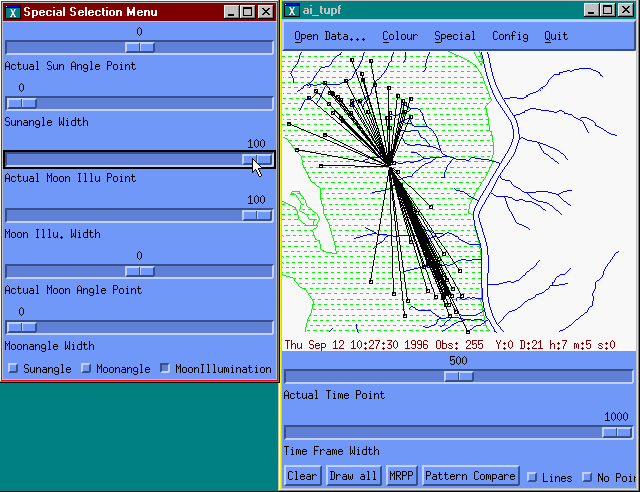
Figure A.4:
The prototype
application TUPF: with the auxiliary window on the left special selections
of the data can be performed. The example here uses the amount of
moon illumination as a selection criteria. First, the mechanism
needs to be activated by pushing the button pointed to by the
green arrow. Then the width of the data frame (lower blue arrow)
and the actual time point (percent illumination) can be defined
and changed. The window is live linked to the map window shown on the
right side.
Animation:
AVI or
QuickTime Movie or
animated GIF.
|
|
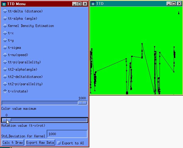
As the main map window is used for georeferenced data representation,
an auxiliary window is used for the calculation of the various types
of plots from the Time Plot Family. TT-Plots and TT2-Plots can
be easily explained in a static illustration. One of the Time Plots
that can only be understood when seeing a dynamic example is the T-r
plot. Such a plot is therefor illustrated in figure A.5.
Figure A.5:
The prototype
application TUPF: The T-r plot is illustrated. To activate the
T-r plot the appropriate button must be selected in the window on
the right (green arrow). After that, the angle from which the T-r plot is
calculated can be defined and changed by moving the scalebar
pointed to by the blue scalebar. In the window on the right side
the T-r plot is shown and updated immediately. The little arrow
pointed to by the blue arrow on the right indicates graphically
the rotation angle.
Animation:
AVI or
QuickTime Movie or
animated GIF.
|
|
Next: Glossary of Time
Up: Development of Methods
Previous: Discussion and Epilogue
Contents
![\includegraphics[scale=0.6]{images/tupf_main2.eps}](img159.gif)
![\includegraphics[scale=0.8]{images/tupf_bar1.eps}](img160.gif)
![\includegraphics[scale=0.8]{images/tupf_bar2.eps}](img161.gif)
![\includegraphics[scale=0.8]{images/tupf_spec_sel.eps}](img162.gif)
![$\textstyle \parbox{13cm}{{\bf {Ambiguous time}} \\ [0.2cm] \begin{tabular}{p{0....
... seconds, it is ambiguous as to the day, month, and
year.}\\ \end{tabular} \\ }$](img164n.gif)